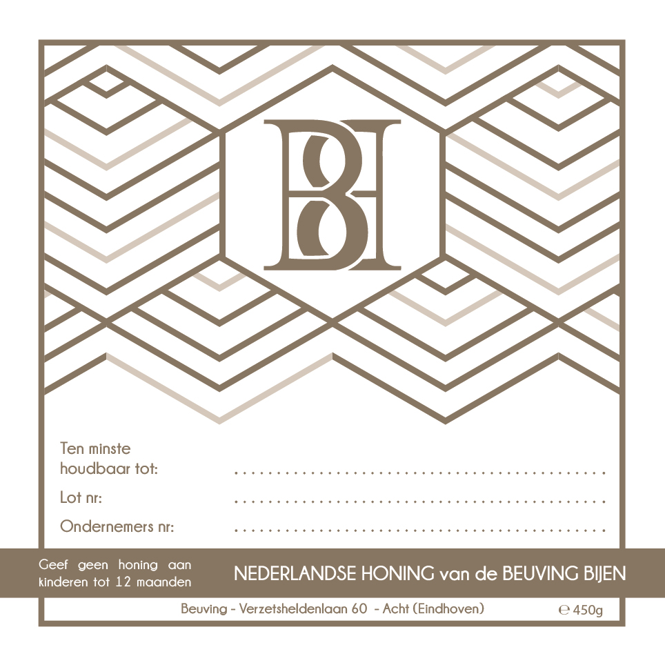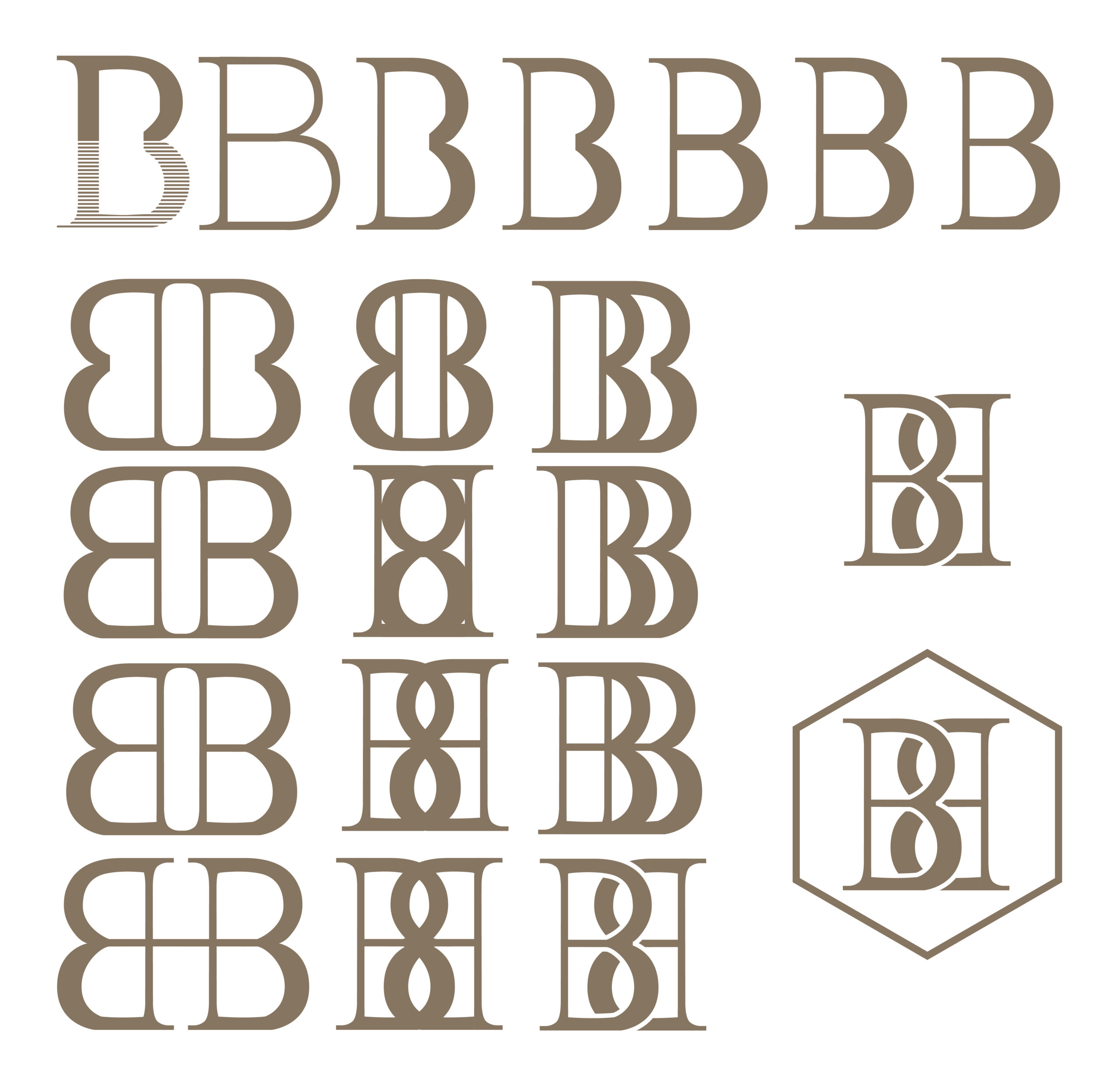


Drawing inspiration from the name “Beuving Bijen” (which translates to “Beuving Bees,” with Beuving being a family name), I embarked on a creative journey to design a logo that would embody the spirit of their honey production. The focal point of the logo is the fusion of the two letter “B’s,” representing both the family name and the bees themselves. By cleverly combining these elements, I crafted a visual representation that forms an “H” for honey and an “8” to signify the location.
The significance of the “8” lies in the fact that the two bee hives are situated in Acht, a Dutch word meaning “eight.” This thoughtful inclusion pays homage to the local surroundings while adding a unique touch to the branding.
Through this logo, I aimed to encapsulate the heart and soul of the Beuving Bijen honey business. It serves as a symbol of their commitment to producing exquisite honey, while also reflecting their deep connection to the local community.
